Last week’s discussion on the size of the bailout expenditures generated some interesting buzz. A few others picked up on the size, and created a few different ways to depict the amount of money involved.
These have been my favorites:
>
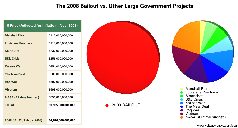
Bailout Pie Chart
chart courtesy of voltagecreative
>
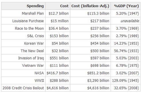
Prior Bailouts as a % of US GDP
via mindtangle (note that this data is already old!)
>
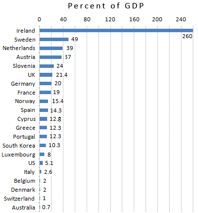
Global Bailouts per National GDP
chart courtesy of Portfolio
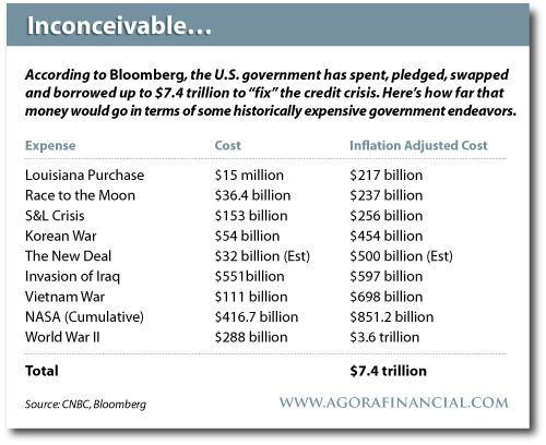
>
via Agora Financial


